JOLONG
JOLONG Machinery Industry Co., Ltd. was established in 1976, specializing in the production of diversified lubrication equipment and automotive repair tools, and is dedicated to providing high-quality products that have been highly praised by various sectors. After more than 40 years of development, the company aims to update its old logo, identity system, and product colors to bring a fresh new look to its corporate image. Noticing that most automotive repair equipment on the market typically uses red as the primary color, we decided to create a brand-new color scheme for JOLONG Machinery Industry Co., Ltd. to highlight a distinctive style. Additionally, the original logo design appeared somewhat traditional and rigid, so we reinterpreted the gear element with an innovative graphic to showcase a modern feel, reflecting JOLONG’s commitment to innovation, research and development, and professional quality.
DESIGN ITEMS
┃ BRAND ┃ LOGO ┃ COLOR ┃ TYPOGRAPHY ┃ GRAPHICS ┃ DOCUMENT ┃
┃ PHOTOGRAPHY ┃ POSTER ┃ CATALOG ┃ WEBSITE ┃


LOGO DESIGN
JOLONG Machinery Industry Co., Ltd. (JOLONG) focuses on the production of lubrication equipment. Therefore, in the logo design, we used the key conceptual elements of “gear,” “lubrication,” “sustainability,” and “durability.” We thoughtfully explored creative ways to incorporate these elements into the logo and presented 16 different conceptual designs for the client to choose from. Our goal is to showcase JOLONG’s professionalism and commitment to robust products, delivering a unique and striking corporate identity.
STANDARD COLOR
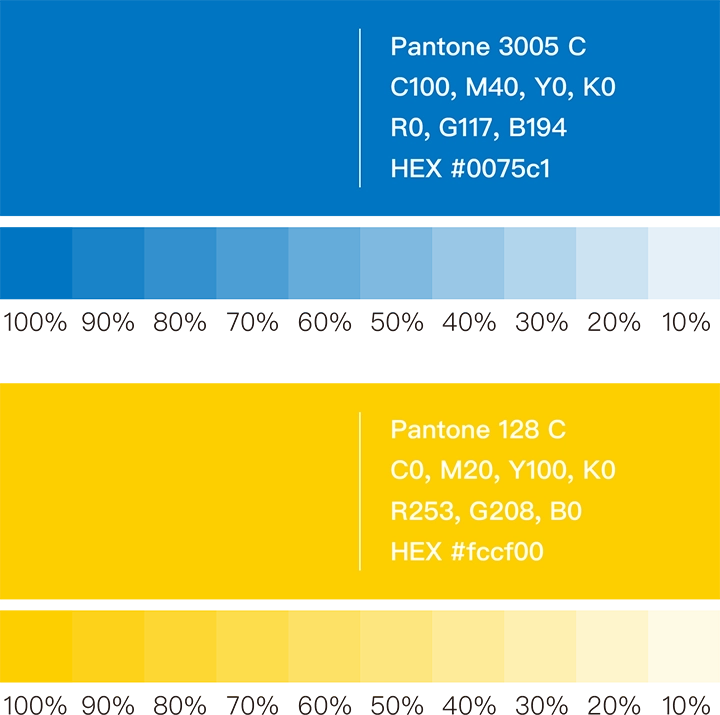
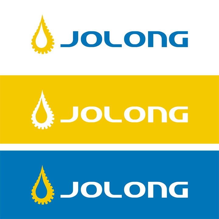
We noticed that red is commonly used as the primary color in automotive repair equipment on the market. Therefore, we decided to create a brand-new color scheme for JOLONG Machinery Industry Co., Ltd. (JOLONG) to highlight a distinctive style. In selecting the colors, we aimed for a sense of “stability” and “elegance,” choosing nine colors with these qualities to be practically applied to the products. This allows customers to truly experience the beauty of the new color scheme and helps JOLONG stand out among the many red automotive tools. Ultimately, we selected royal blue (PANTONE 3005 C) and chrome yellow (PANTONE 128 C) as the unified standard colors for future product colors and the identity system.
TYPOGRAPHY DESIGN
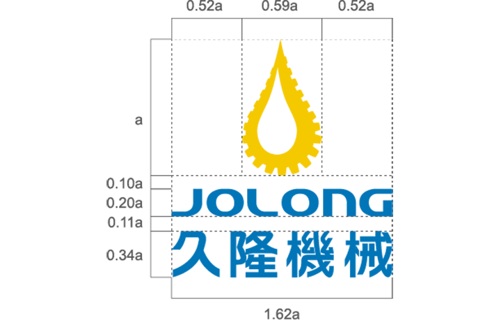
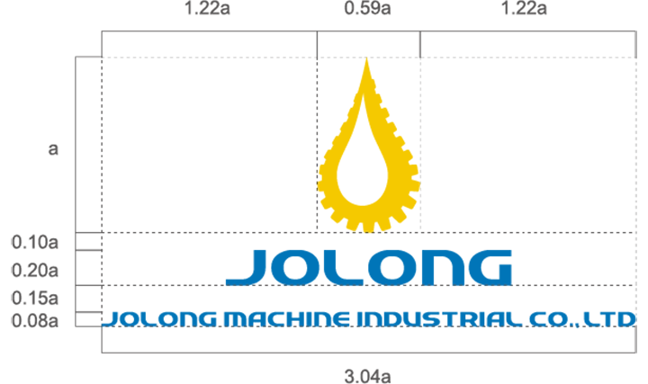
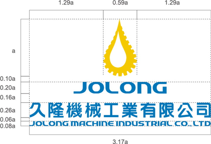
After careful consideration, we finalized a logo and designed a custom hand-drawn bilingual font (Chinese and English) specifically for it. This unique typeface not only complements the logo perfectly, achieving optimal visual harmony, but we also established a unified typography guideline to set consistent standards for all future promotional materials and products.




CREATIVE GRAPHICS
We designed a creative graphic for JOLONG’s slogan, “We make the world smoother.” Through this design, we aim to convey how JOLONG contributes to making the industrial processes around the world run more smoothly. This graphic not only interprets the slogan but also vividly represents JOLONG’s core values, adding depth and meaning to the brand image.
DOCUMENT DESIGN
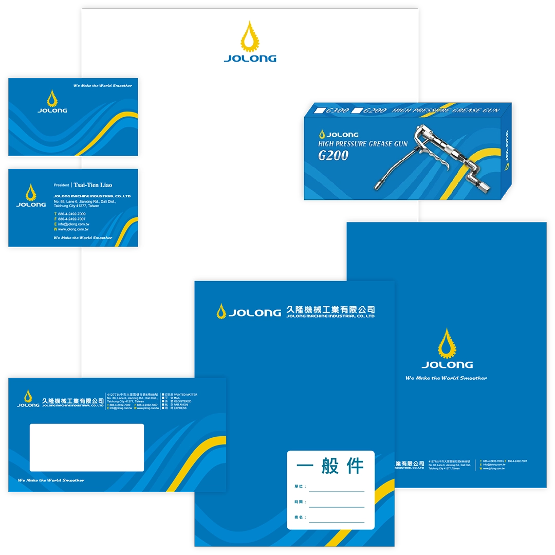
Finally, we integrated the logo, standard colors, typography, and creative graphics into a unified visual identity system. This system will be applied across business cards, envelopes, packaging, posters, catalogs, and the website. The design aims to enhance JOLONG’s market visibility and strengthen brand consistency, allowing consumers to deeply appreciate the professionalism and uniqueness the brand represents. Through this cohesive identity system, JOLONG will showcase a stronger brand presence across various media platforms, making the company’s image more striking and influential.
PHOTOGRAPHY
Finally, the client carried out brand and product transformations based on the CIS system we designed. Subsequently, we conducted commercial photography for the new products. The photos from this shoot will be used in posters, catalogs, and the website, showcasing the company environment, product manufacturing, quality control, and product categories. To ensure a smooth photography process, we will undertake thorough planning and preparation beforehand, so that the photos and visuals effectively capture the key elements that need to be presented.
POSTER DESIGN
CATALOG DESIGN
In the design of the catalog and website, we placed great emphasis on the planning process, carefully considering how to best present the company’s environment, production processes, quality control, and product categories. Before beginning the actual design work, we first gathered relevant company information and thoughtfully planned the theme, copy, and imagery for each page. Only after reaching a clear consensus with the client did we proceed with copywriting, commercial photography, and digital design. At the same time, we integrated the visual identity of the CIS branding system into the design to firmly convey the core values and professional strengths of JOLONG Machinery Industrial Co., Ltd. through the catalog and website.
WEBSITE DESIGN
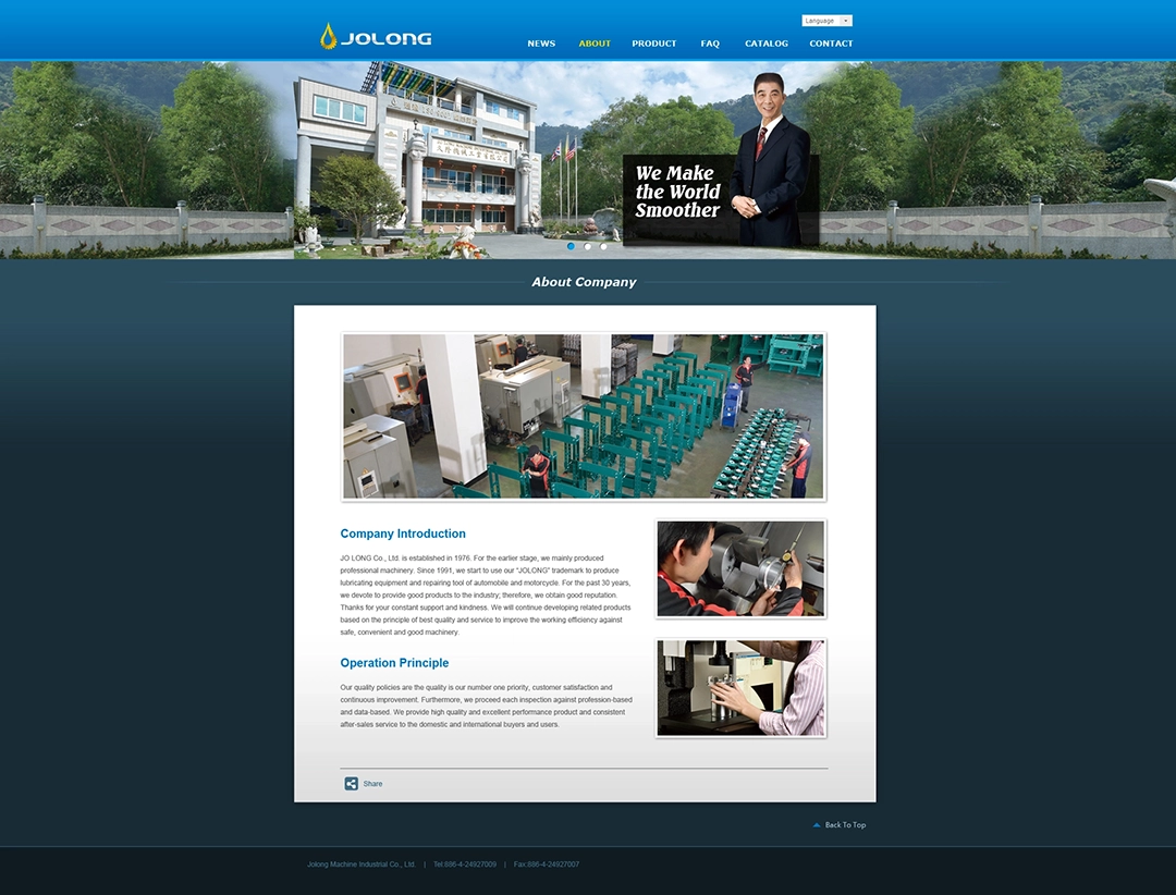
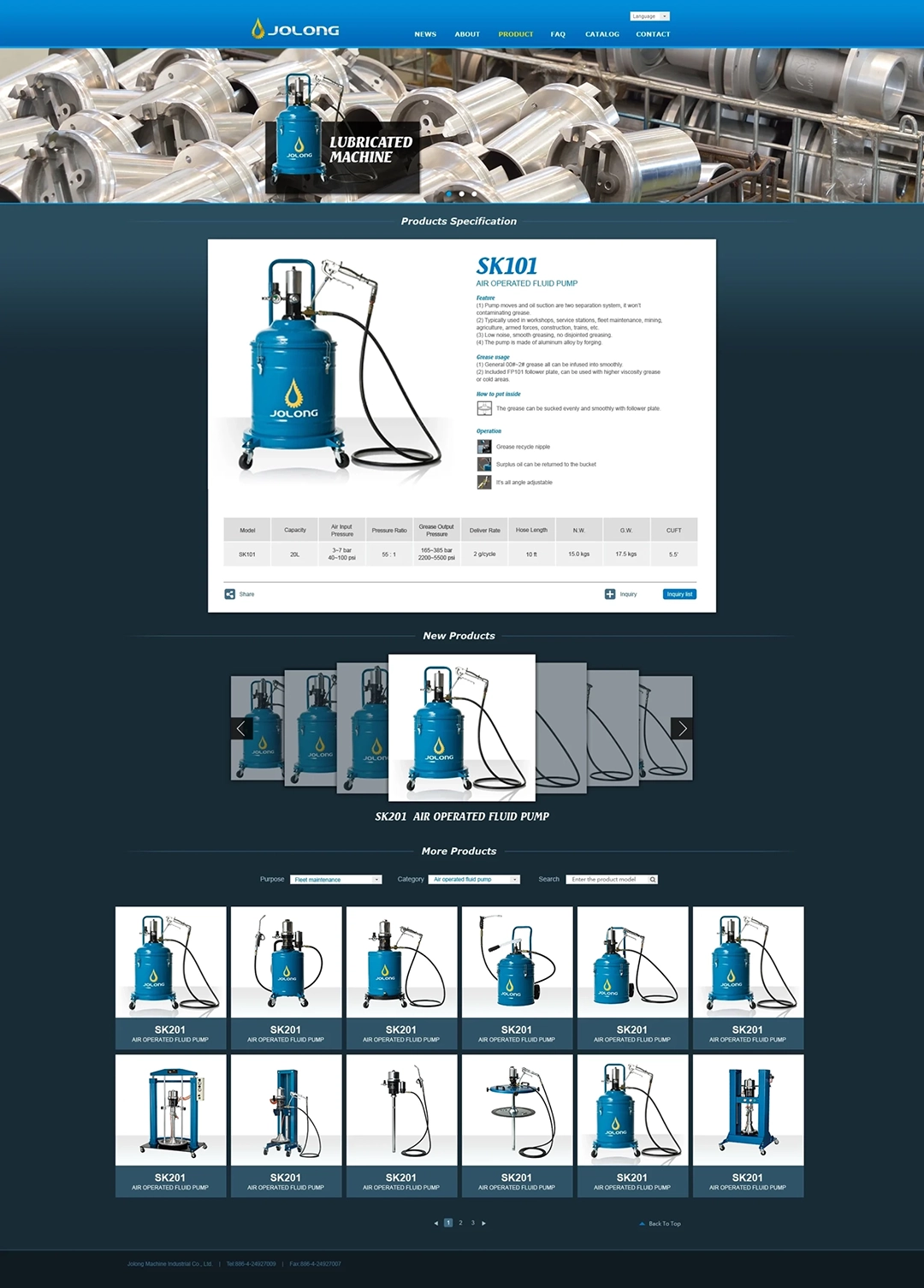
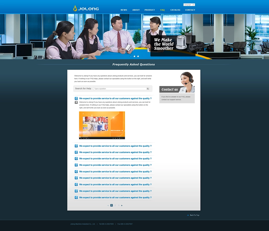
We incorporated photographs, the logo, standard colors, typography, and creative graphics into the website design. These elements infuse the JOLONG Machinery Industrial Co., Ltd. website with a distinctive brand style and character, effectively showcasing the company’s professionalism and unique identity.

