SMARTOP
In the SMARTOP brand, SMART symbolizes intelligence, TOP represents excellence, and ART stands for art. SMARTOP is dedicated to creating an elegant, aesthetically pleasing, and creative stationery brand, actively gathering numerous talented designers to showcase their works on the international stage. This time, the client specifically entrusted us to establish SMARTOP’s brand identity system, including the logo, standard colors, typography, creative patterns, and designs for general office supplies. Through this complete brand identity system, we aim to accurately convey SMARTOP’s brand spirit and values.
DESIGN ITEMS


LOGO DESIGN
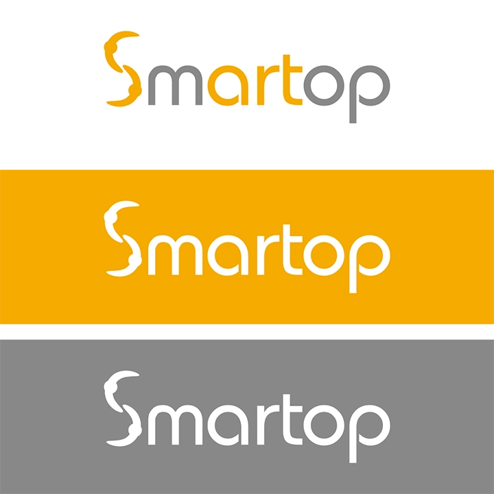
SMARTOP focuses on building a platform that gathers creative ideas. Therefore, in the logo design process, we especially emphasized elements such as “creativity,” “surprise,” “collaboration,” and “art” as our core design concepts. We carefully created 16 different logo concepts for the client to choose from. Each logo underwent in-depth analysis and presented unique ideas and concepts for the client’s consideration. Ultimately, the chosen logo incorporates the meaning of collaboration into the shape of the letter “S” and highlights the word “art” in the typography, symbolizing the brand’s emphasis on the spirit of art.
STANDARD COLOR
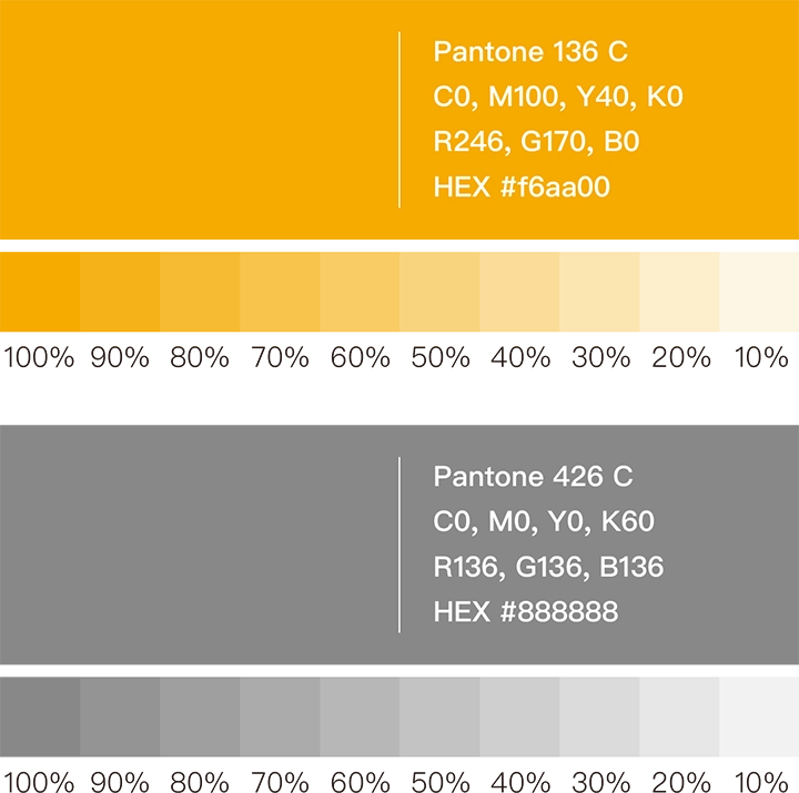
In the process of selecting the standard colors, we carefully chose two hues to reflect the brand’s vitality and stability. Deep yellow (Pantone 136 C) represents energy and positivity, while medium gray (Pantone 426 C) symbolizes a relaxed and steady tone. These two colors will serve as the primary palette for the brand’s identity system, signifying that the SMARTOP brand embodies a proactive mindset, embraces innovation, and advances steadily with confidence.
STANDARD FONT DESIGN
We specially designed a unique hand-drawn Chinese typeface for SMARTOP. This delicately rounded font aims to showcase SMARTOP as a brand with thoughtful ideas and smooth communication. At the same time, it establishes a unified standard for typography, enhancing the overall brand image and providing clients with a more consistent and professional experience.


VISUAL DESIGN
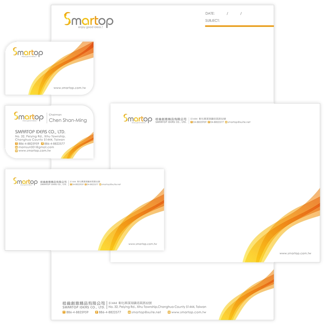
In the visual design, we specially illustrated symbols representing warm currents to highlight SMARTOP’s passionate temperament and vibrant energy. These graphics were created as background patterns that can be applied to exhibitions, promotional materials, and other business items in the future, emphasizing SMARTOP’s unique charm and professional image.
STATIONERY DESIGN
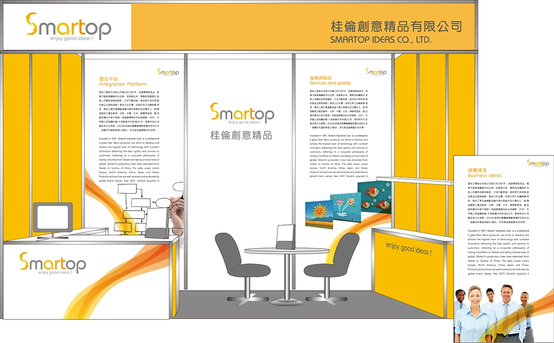
Ultimately, we integrated the logo, standard colors, typography, and creative graphics into business materials and exhibition spaces to form a unified identity system. This enhanced the consistency of the SMARTOP brand image, allowing SMARTOP to showcase its unique charm across various media platforms, making the brand image more striking and impactful.
