However, with changes in the market environment, shifts in consumer demand, and continuous technological advancements, many well-known brands choose to update and adjust their logos to maintain a sense of modernity and adaptability. This ongoing process of logo evolution is not merely a visual refresh — it reflects a deeper repositioning of the brand’s identity and values in response to the times.
A successful logo evolution is often accompanied by broader strategic shifts within the company. Whether it’s expanding market share, entering new markets, or enhancing brand relevance among younger audiences, updating the logo becomes a key element in the brand’s overall transformation. Through these evolving designs, brands not only attract new consumer segments but also rekindle loyalty among existing customers.
To gain a deeper understanding of the significance of logo evolution, we will examine how five widely recognized brands — Apple and Windows from the tech industry, Mercedes-Benz from the automotive sector, Gucci from fashion, and Starbucks from food and beverage — have transformed their logos over time. Their logo evolutions reflect industry-wide shifts and demonstrate how brands use visual language to communicate their core values and future vision.

1. Apple: Simplifying Technology
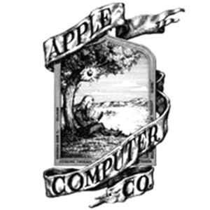
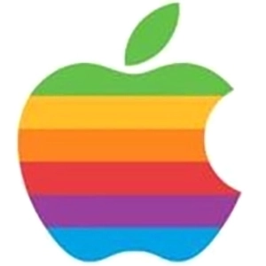
Apple’s logo evolution is a textbook example of the simplification trend in tech branding. The first Apple logo, designed by Ronald Wayne, was a complex illustration depicting Isaac Newton sitting under an apple tree—symbolizing the source of wisdom. In 1977, Apple replaced it with the iconic rainbow-striped apple logo, representing the company’s innovation and diversity. By 1998, Apple abandoned the rainbow design in favor of a sleek, monochrome version, reflecting a more modern and stylish image. Today, Apple’s logo is predominantly minimalist and monochromatic, perfectly embodying the brand’s values of simplicity and efficiency.


2. Windows: Evolving from Classic to Modern
The logo evolution of Windows reflects its journey through changing design trends and brand identity. Since its debut in 1985, the original Windows logo featured a multicolored, three-dimensional window, symbolizing diversity and innovation. By 1992, with the release of Windows 3.1, the design shifted to a flatter, more color-coordinated style. In 2001, Windows XP introduced a logo with softer tones and rounded edges, creating a friendlier appearance. The most significant step in the logo evolution came in 2012 with Windows 8, when the logo was completely redesigned into a monochromatic rectangular window with clean, simplified lines—mirroring Microsoft’s embrace of modern, minimalist design principles.


3. Benz: Merging Luxury and Technology
The logo evolution of Benz reflects its journey from industrial origins to luxury excellence. The earliest design featured gears and encircling letters, symbolizing the brand’s industrial roots. In 1909, the iconic three-pointed star logo made its debut, representing the company’s ambition to excel on land, sea, and air. Over time, the three-pointed star became a timeless symbol of Benz and was gradually simplified. Today, the Benz logo consists of a sleek three-pointed star enclosed in a circle, symbolizing the brand’s dominance in the luxury automotive sector. Its clean yet powerful design perfectly embodies Benz’s core values of elegance, innovation, and excellence.


4. Gucci: Iconic Shifts in Fashion
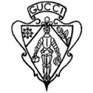
The logo evolution of Gucci mirrors the brand’s growing status and influence within the fashion industry. The earliest Gucci logo, derived from the initials of founder Guccio Gucci, featured a vintage aesthetic. Over time, the interlocking double G emblem emerged as the brand’s iconic symbol, prominently displayed across a wide range of products. In recent years, Gucci’s logo evolution has seen further simplification, with typography refined into a more modern and elegant style. This transformation highlights the brand’s ability to adapt to global fashion trends and appeal to a younger, contemporary audience.

5. Starbucks: Simplifying Culture
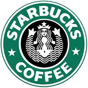
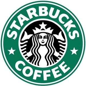
The logo evolution of Starbucks reflects its journey of simplifying culture while strengthening brand identity. Since its founding in 1971, the Starbucks logo has undergone several major transformations. The original logo featured a complex design of a twin-tailed siren, rich in detail, reflecting the brand’s respect for coffee culture and tradition. Over time, Starbucks gradually simplified its logo design. In 1987, the siren was modernized, with reduced surrounding text and details, shifting the focus more directly to the image itself. The most significant step in the logo evolution occurred in 2011, when Starbucks removed the encircling text entirely, leaving only the green siren symbol. This minimalist design underscores the brand’s global identity and broad cultural appeal.


Conclusion:
Logo Simplification and Brand Evolution
The logo evolution of the five brands above clearly demonstrates that as brand identity develops, logo designs are increasingly trending toward simplicity and modernity. This logo evolution is more than just a visual change—it reflects a broader process of brand reinvention and repositioning. A clean and straightforward logo is easier for consumers to remember and more adaptable across various media and applications, thereby enhancing brand recognition and market impact. Therefore, redesigning and simplifying a logo is a key strategy for brands to remain competitive in an ever-changing marketplace.