KINLOCH ANDERSON
KINLOCH ANDERSON is a century-old British apparel brand, renowned for its Scottish tartan patterns. Each product showcases a vintage Scottish style, with the brand positioned for a high-end consumer market. This time, we were commissioned to design packaging for baby and toddler cleaning products. We cleverly utilized the original bear mascot as the main design concept, incorporating the brand’s core values into the bear’s image and characteristics to express a refined vintage taste. This design not only adds a playful element to the packaging but also integrates the unique qualities of baby cleaning products, aiming to stimulate consumer desire to purchase.
DESIGN ITEMS
┃ COLOR ┃ TYPOGRAPHY ┃ GRAPHICS ┃ PACKAGE ┃
STANDARD COLOR
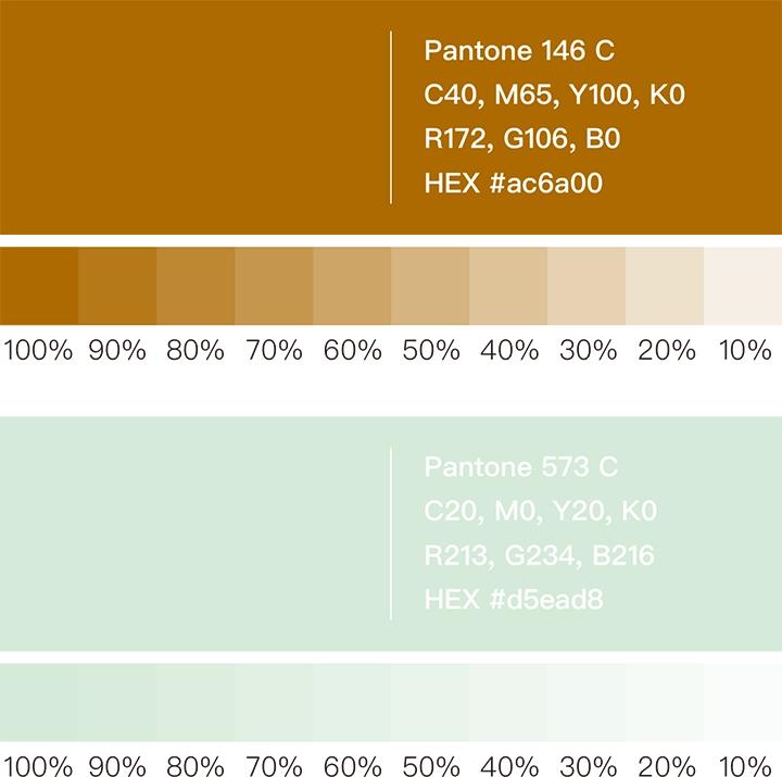
In the process of selecting the standard colors, we focused on “vintage” and “premium” as the main design goals. After careful consideration, we meticulously chose Antique Gold (Pantone 146 C) and Mint Green (Pantone 573 C) from a range of distinctive color options as the unified color scheme for the packaging. This color combination not only embodies a high-end vintage style but also injects a soft emotional tone into the children’s care products, ensuring the overall feel is not too heavy.
TYPOGRAPHY DESIGN
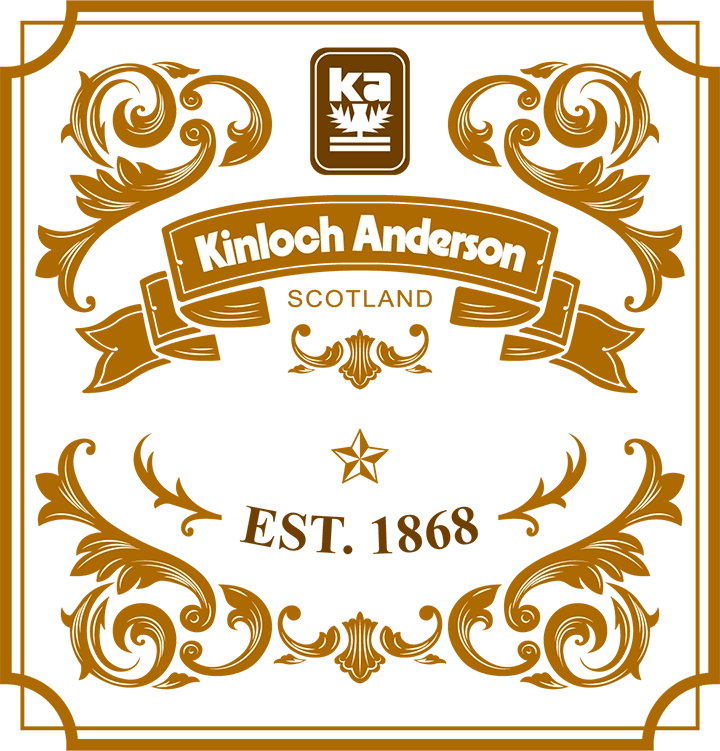
For the choice of the standard font, we selected QuentinCaps. This typeface showcases a distinctive Baroque style, infusing the product names with a premium vintage atmosphere. At the same time, we also incorporated these Baroque vintage elements into the packaging design’s motifs to create a more sophisticated visual effect.

CREATIVE GRAPHICS
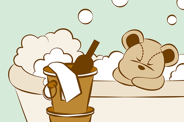
For this packaging design, we focused primarily on the Kinloch Anderson bear mascot illustration as the main concept. When depicting the bear’s behavior, we carefully considered how to align its personality with the lifestyle tastes of consumers. Our bear mascot is characterized as a child who imitates adult sophistication, aspiring to be a young British gentleman. He attempts to emulate adult behaviors such as appreciating classical music, playing golf, playing the piano, savoring black coffee, and enjoying a refined lifestyle. His everyday attire includes a gentleman’s hat, Scottish attire, Oxford shoes, and vintage accessories—portraying a child who strives for a high-quality life. Through this striking contrast, we aim to create a sense of playfulness while showcasing the brand’s pursuit of tasteful living. For example, the bear eating a burger with a knife and fork cleverly hints that the product is intended for children.
PACKAGE DESIGN
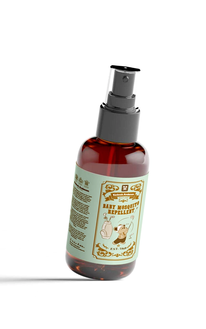
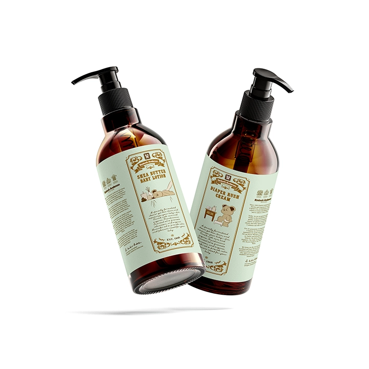
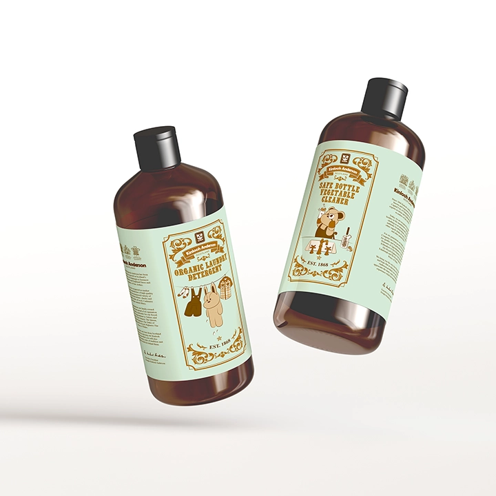
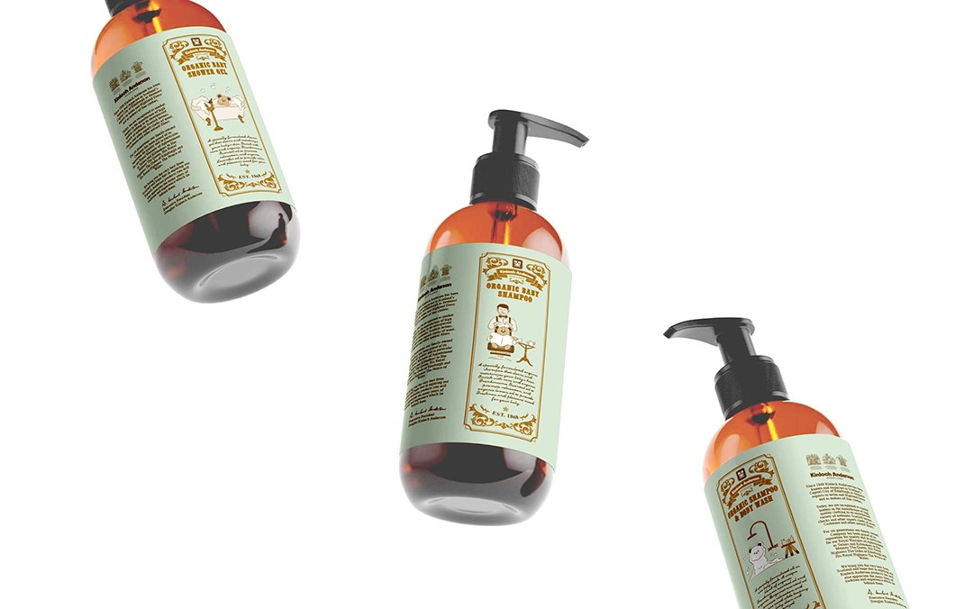
We ultimately designed eight bear mascot illustration themes, including: bathing, shampooing, taking a bath, enjoying a spa, applying lotion, playing golf, hanging laundry, and washing baby bottles. These themes will be applied to the packaging of eight infant and toddler cleaning products—body wash, shampoo, bubble bath, lotion, diaper cream, mosquito repellent, laundry detergent, and dishwashing liquid. Combined with the standard colors, typography, and totems, the designs present a playful and visually appealing look.
