TAIWAN STAR
TAIWAN STAR is a brand focused on producing “ume extract” products. Originating from traditional Japanese health supplements, ume extract appears as a deep black paste with a bitter taste and is popular among consumers in Taiwan. Besides the traditional paste form, it is also available as dried powder or in pill form resembling traditional Chinese medicine balls. These products offer multiple benefits, such as aiding digestion and relieving fatigue. Since the appearance of ume extract resembles unpopular black pills, in our design we aimed to move away from the traditional medicine box style. Instead, we used illustrations to vividly depict the year-round production story of ume extract, thereby expressing the brand’s culture and values.
DESIGN ITEMS
┃ BRAND ┃ LOGO ┃ COLOR ┃ TYPOGRAPHY ┃ GRAPHICS ┃ PACKAGE ┃
┃ DOCUMENT ┃


LOGO DESIGN
In the logo design, we started with the concept of “TAIWAN STAR 寶島明星” After careful crafting, we presented 16 locally styled logo options for the client to choose from, each embodying different aspects of Taiwan’s culture and meaning. Among these designs, we ultimately selected the imagery symbolizing Taiwan’s landmark, Sun Moon Lake. This logo not only aptly reflects the spirit and cultural essence of the TAIWAN STAR brand but also highlights the brand’s emotional connection to Taiwan and its celebration of local culture.
STANDARD COLOR
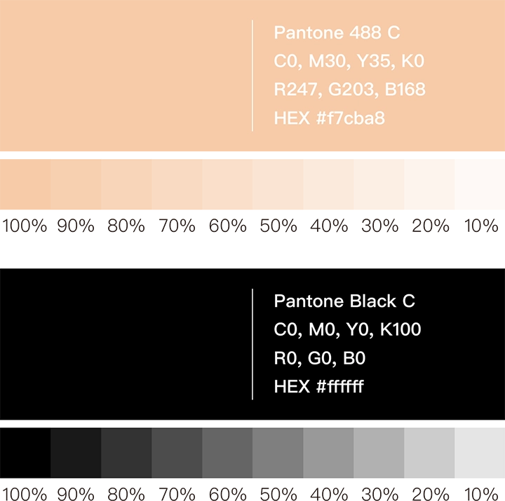
For the selection of standard colors, since the “梅精” product is primarily black, we chose black as the base to highlight the product’s characteristics and elegant atmosphere. At the same time, we replaced the character “精” with “金” to convey nobility not only in meaning but also visually. For the color palette, we selected a rose gold with an appetizing quality to represent this concept. Ultimately, we finalized Rose Gold (Pantone 488 C) and Black (Pantone Black C) as the unified color standards for future packaging. This color combination not only effectively showcases the product’s attributes but also enhances the presentation of packaging illustrations, making the overall product image more striking and eye-catching.

TYPOGRAPHY DESIGN
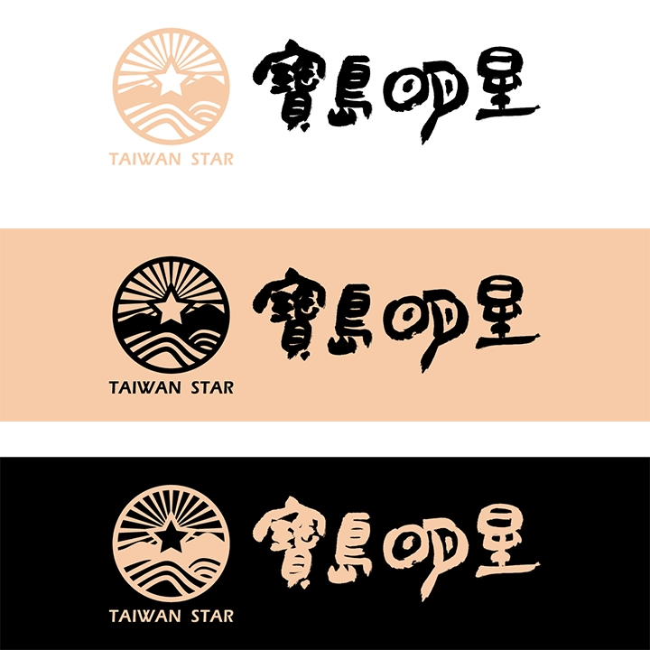
To convey the cultural heritage of traditional food, we specially commissioned a calligrapher to inscribe the four characters “寶島明星” (Taiwan Star). We cleverly transformed the “日” (sun) and “月” (moon) elements within the character “明” (bright) into visual symbols that resonate with the “Sun Moon Lake” concept in the logo. This typography design not only fully reflects traditional culture but also perfectly complements the “Sun Moon Lake” logo of Taiwan Star, achieving an ideal conceptual connection. At the same time, we established unified layout guidelines to ensure that all future packaging and promotional materials adhere to a consistent visual standard. The goal is to enhance the overall image of the TAIWAN STAR brand, providing customers with a more cohesive and professional brand experience.


CREATIVE GRAPHICS
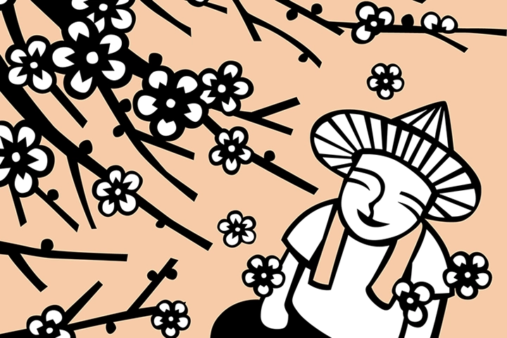
In the creative graphic design, we employed the technique of woodblock printing to create a series of illustrations depicting the four seasons. These vivid illustrations showcase the production process and brand story of “Ume Extract,” highlighting its rich cultural heritage and valuable product essence.
SPRING
In spring, the farmer wears a bamboo hat and sleeves, standing in the morning light accompanied by birdsong, moving among the plum trees. The green plums hang heavily, emitting a sweet and tangy fragrance that makes one’s mouth water. The farmer’s taste buds are already stimulated by the aroma, eagerly anticipating the harvest of these plump, delicious fruits.
SUMMER
In summer, a refreshing breeze blows through the forest, and the farmer’s favorite moment is to hide under the shade of the trees, dehydrating the plums and leisurely simmering the plum extract paste. Watching the plum juice transform from bright green to deep black, his mood relaxes with the rhythm of stirring. At this moment, humming his favorite song, he savors this peaceful tranquility.
AUTUMN
In autumn, the farmer steps on a ground covered with golden fallen leaves, gently touching the rough tree trunks. He knows well that this is just a brief rest for the plum trees. During this time, he spreads fertilizer to revitalize the trees, eagerly anticipating the next cycle of life, when the trees will bloom brilliantly once again.
WINTER
In winter, petals dance slowly in the wind, swirling gracefully among the plum groves. The farmer sits beneath the trees with a beaming smile, quietly admiring the plum blossoms as they fall like snowflakes. The faint, gentle fragrance softly soothes his year-long hard work, while also symbolizing the approaching season of abundance.
PACKAGE DESIGN
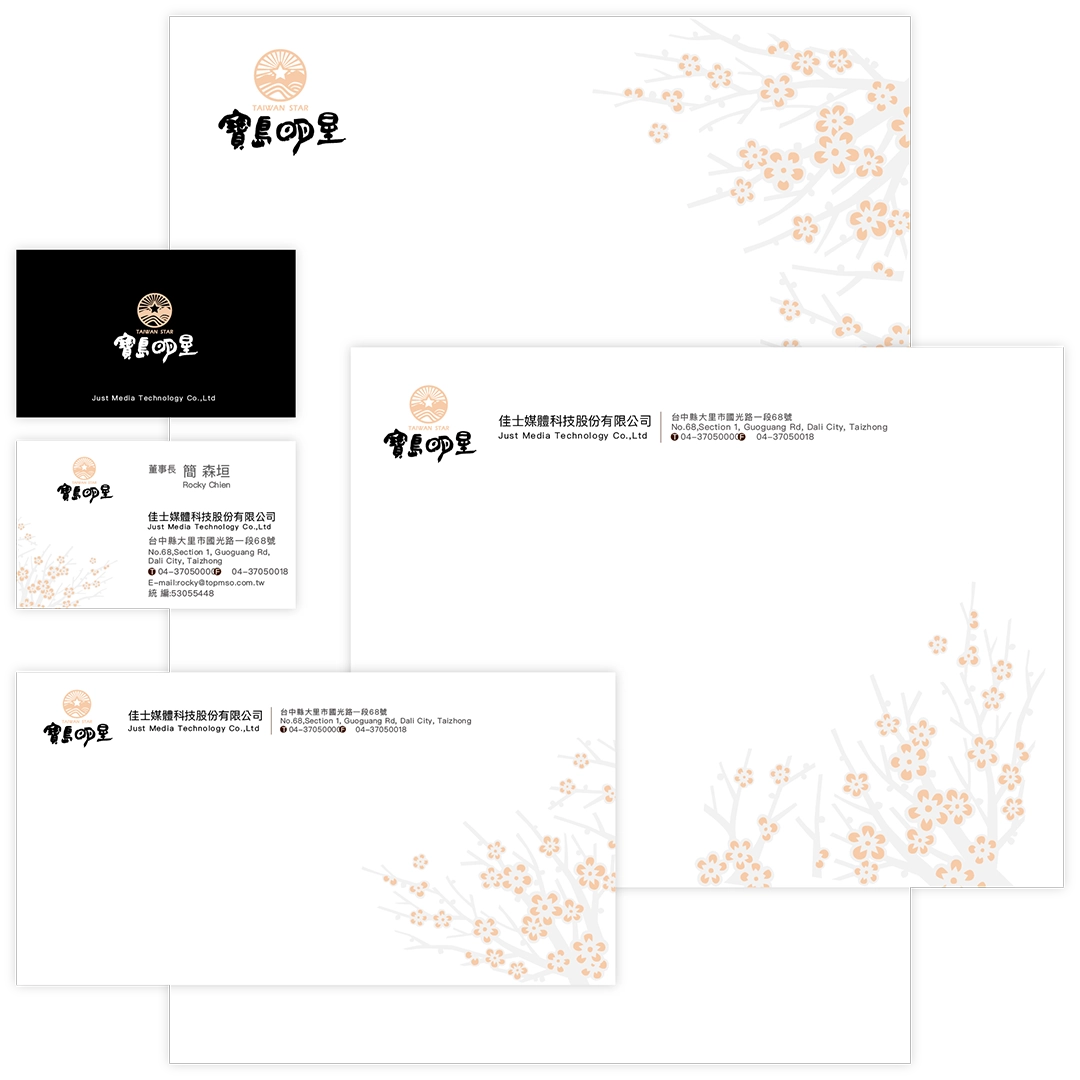
Finally, we integrated the logo, standard colors, typography, and creative graphics into the packaging and stationery, creating a unified identity system. The establishment of this system enhanced the brand’s consistency, allowing TAIWAN STAR to showcase a stronger brand presence across various media platforms. Through this identity system, consumers gain a deeper appreciation of the brand’s essence and culture, making TAIWAN STAR’s brand image more striking and influential.
DOCUMENT DESIGN
