WARM COFFEE
WARM COFFEE is a small coffee station affiliated with the Taichung City Association for the Disabled, dedicated to cultivating professional coffee brewing skills among people with disabilities while providing them opportunities to enhance social interaction. We were honored to be commissioned by this organization to design their brand packaging. Through our design, we hope consumers can deeply feel that WARM COFFEE represents not just a warm cup of coffee, but also a heartfelt warmth and gratitude for the opportunities given to these individuals to grow.
DESIGN ITEMS


LOGO DESIGN
For this logo design, we used charmingly naïve lines to depict an innocent and adorable child holding a warm cup of coffee. Through this logo, we aim to convey a sense of simplicity, sincerity, and genuine service and values.
STANDARD COLOR
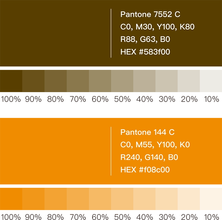
In selecting the standard colors, we carefully considered that the main product is coffee. We chose Coffee Brown (Pantone 7552 C) and a vibrant Orange-Red (Pantone 144 C) as the brand’s primary color palette. These two colors will serve as the main tones for the future unified packaging identity system. This combination not only highlights the product’s characteristics but also brings a warm and heartfelt energy to the overall brand packaging.

TYPOGRAPHY DESIGN
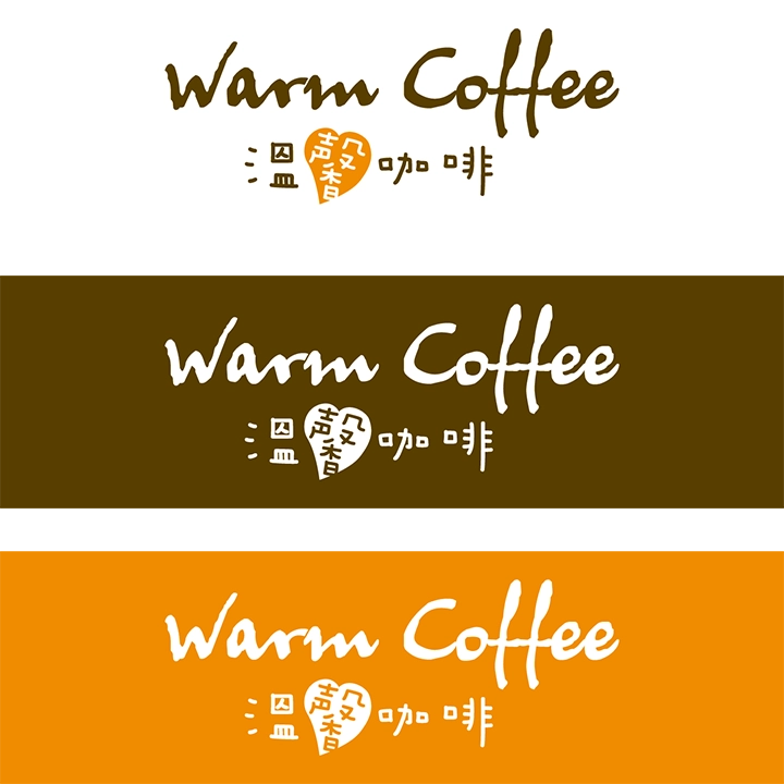
The WARM COFFEE brand conveys a sense of childlike charm and sincerity. Therefore, in the design of the standard typeface, we adopted a hand-drawn style to create a cute and approachable font. In particular, we incorporated a heart symbol into the character “馨” to highlight WARM COFFEE’s emphasis on care and compassion.


CREATIVE GRAPHICS
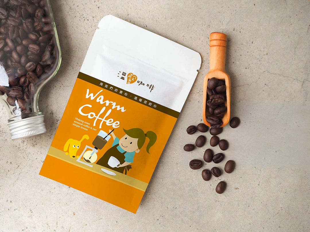
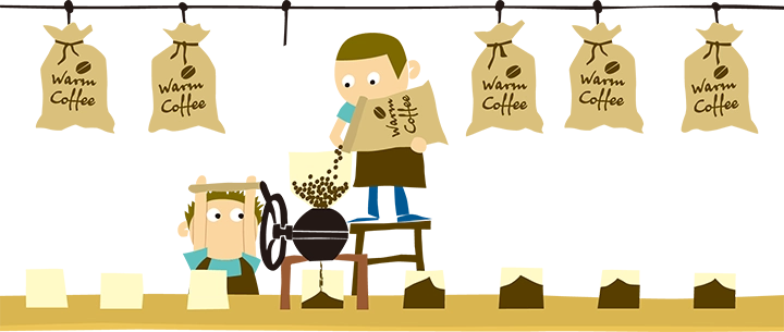
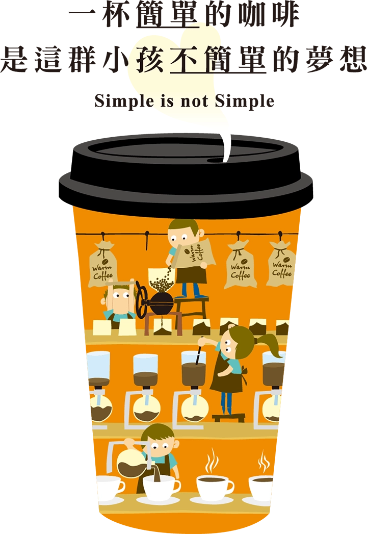
Since WARM COFFEE is dedicated to helping children develop professional coffee-brewing skills, we adopted a whimsical line style and playful illustration approach in the creative graphics design. We created a series of illustrations depicting children earnestly roasting and brewing coffee, showcasing their sincerity and hard work. At the same time, we hope to convey to consumers that what they are purchasing is not just a cup of coffee—but a meaningful opportunity that supports the growth and development of these children.


PACKAGE DESIGN
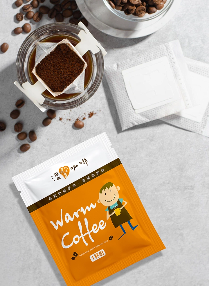
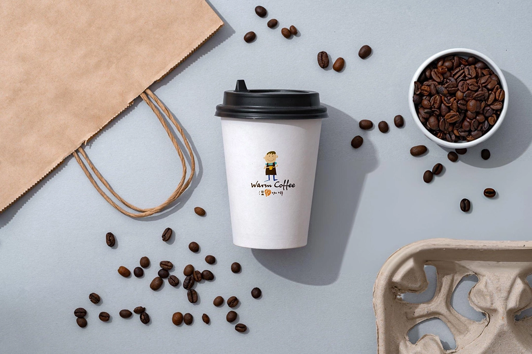
In the end, we integrated the logo, standard colors, custom typography, and creative illustrations into the packaging design, allowing consumers to deeply experience the spirit and warmth of the WARM COFFEE brand. This cohesive visual identity not only enhances the brand’s image but also makes it more distinctive and impactful in the eyes of the public.
