HOCHIN
Heqing Xiangtang has long been dedicated to promoting the culture of incense appreciation and tea ceremonies, with a profound academic foundation and emotional connection to agarwood. They continue to provide the highest quality products. In this collaboration, we aimed not only to enhance the brand image but also to expand its appeal to a broader age range. In the design, we cleverly used the flowing lines of incense smoke to form various auspicious patterns, symbolizing blessings for consumers. This approach not only highlights the product’s characteristics but also brings a fresh perspective to traditional culture.
DESIGN ITEMS
┃ BRAND ┃ LOGO ┃ COLOR ┃ TYPOGRAPHY ┃ GRAPHICS ┃ DOCUMENT ┃
┃ POSTER ┃ PACKAGE ┃ PHOTOGRAPHY ┃ WEBSITE ┃


LOGO DESIGN
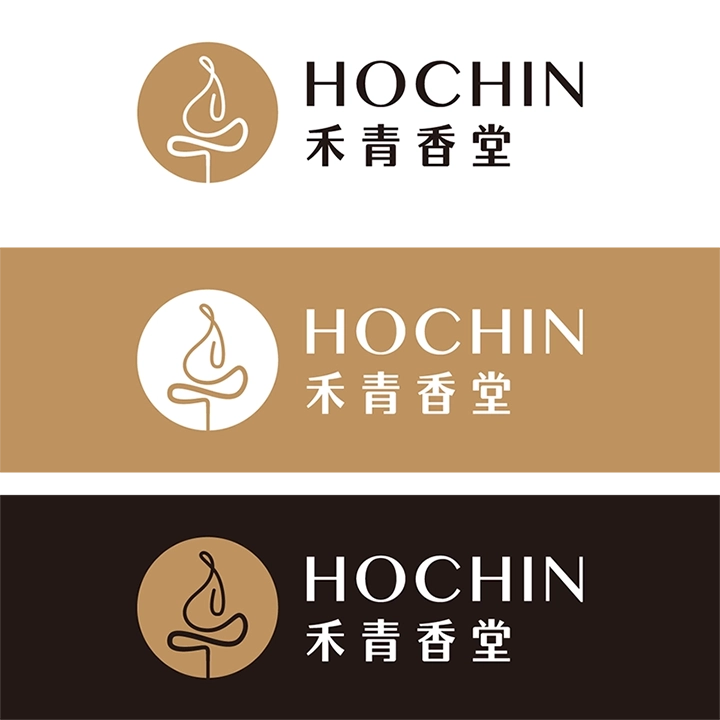
Heqing Xiangtang HOCHIN is a brand dedicated to promoting the culture of agarwood, with a long-standing focus on the art of incense appreciation and tea ceremony culture. In our logo design, besides conveying the profound meaning of agarwood, we also aimed to incorporate elements of Zen and artistic tones. Therefore, we carefully crafted 16 different designs, each with unique shapes and meanings, for the client to choose from. Every design represents the brand’s pursuit of a Zen lifestyle and artistic sentiment, aiming to showcase Heqing Xiangtang HOCHIN’s unique cultural heritage and brand spirit. Through these designs, we hope consumers can not only appreciate the charm of agarwood but also deeply experience the inspiration and tranquility brought by a Zen way of life.
STANDARD COLOR
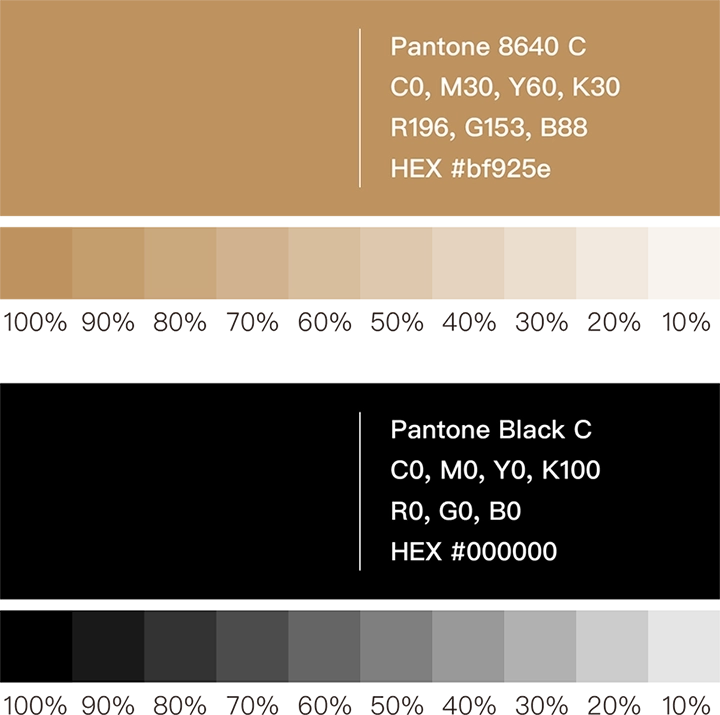
The chosen standard color is Rose Gold (PANTONE 8640 C), complemented by gray, black, and white. These colors are selected to convey the brand’s calmness and elegant temperament. We applied this color scheme to the logo and logotype, laying a solid foundation for the future identity system.


TYPOGRAPHY DESIGN
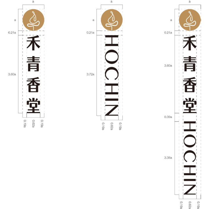
For the logotype, we ultimately selected one logo and designed a custom hand-drawn typeface to achieve the best visual harmony. This unique typeface not only complements the logo but was also further developed into a unified identity system, standardizing its application across future designs such as business cards, envelopes, promotional materials, packaging, and websites. The purpose of this system is to highlight the cultural charm of Heqing Xiangtang HOCHIN and enhance the consistency and professionalism of the brand image. Through a unified typographic style and design guidelines, we aim to infuse the HOCHIN brand with greater elegance and appeal, allowing consumers to deeply appreciate the cultural heritage and values the brand represents.



CREATIVE GRAPHICS
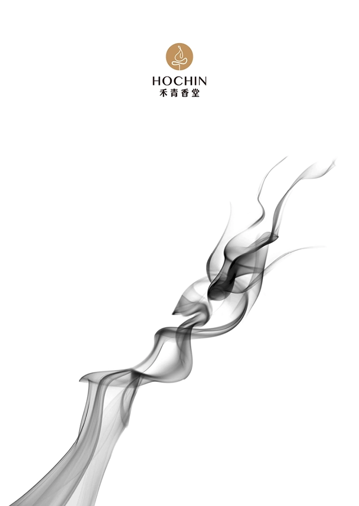
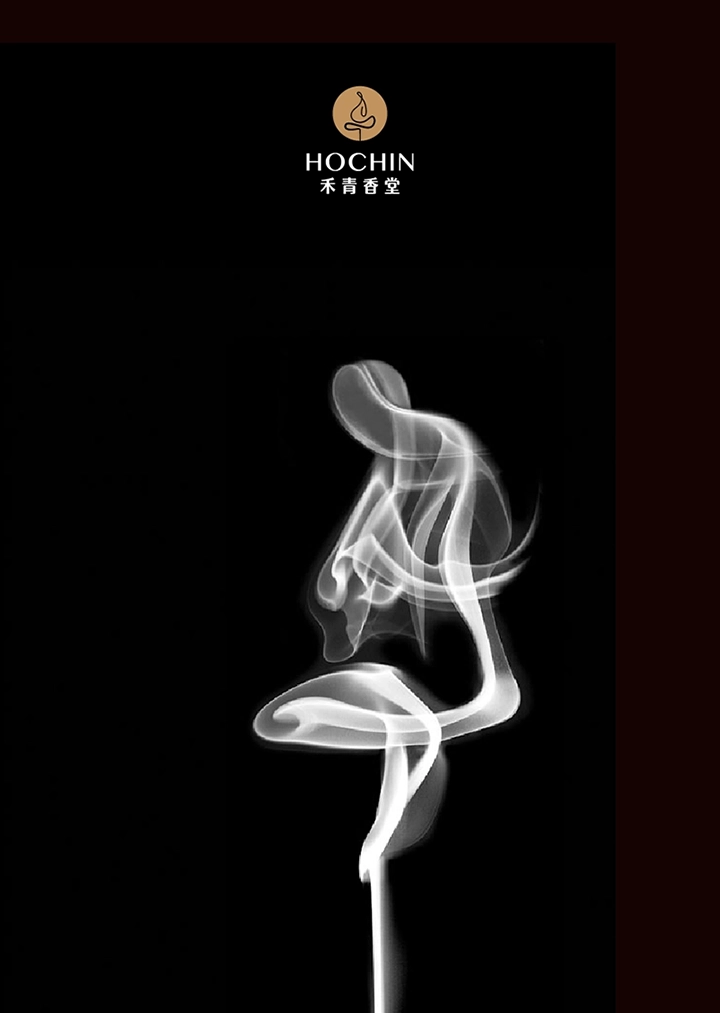
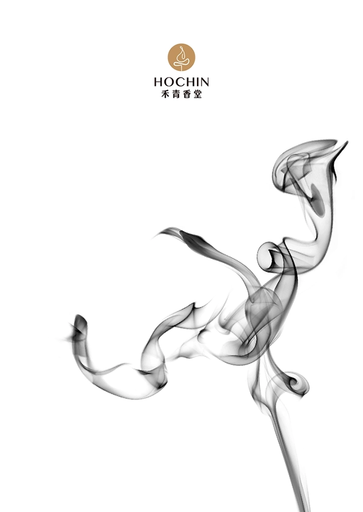
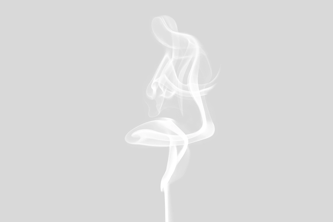
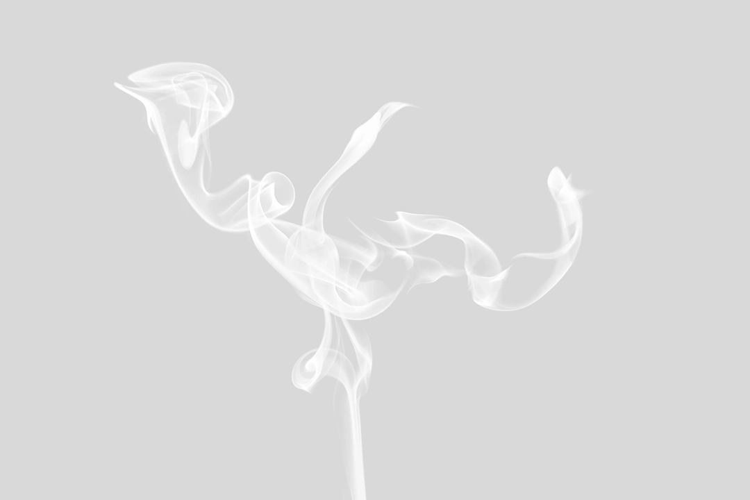
In the design of creative graphics, we skillfully incorporated the flowing lines of incense smoke released during fragrance rituals to illustrate four meaningful symbols: “Zen,” “Dragon,” “Crane,” and “Ruyi” (Auspiciousness). These symbols represent blessings for the consumers. We applied these blessing-inspired graphics across various products and designs, including stationery, posters, and packaging. This design approach not only adds a unique cultural depth to the HOCHIN brand but also aims to allow consumers to feel the serene Zen spirit and rich cultural heritage every time they use a HOCHIN product or encounter its related visuals.


DOCUMENT DESIGN
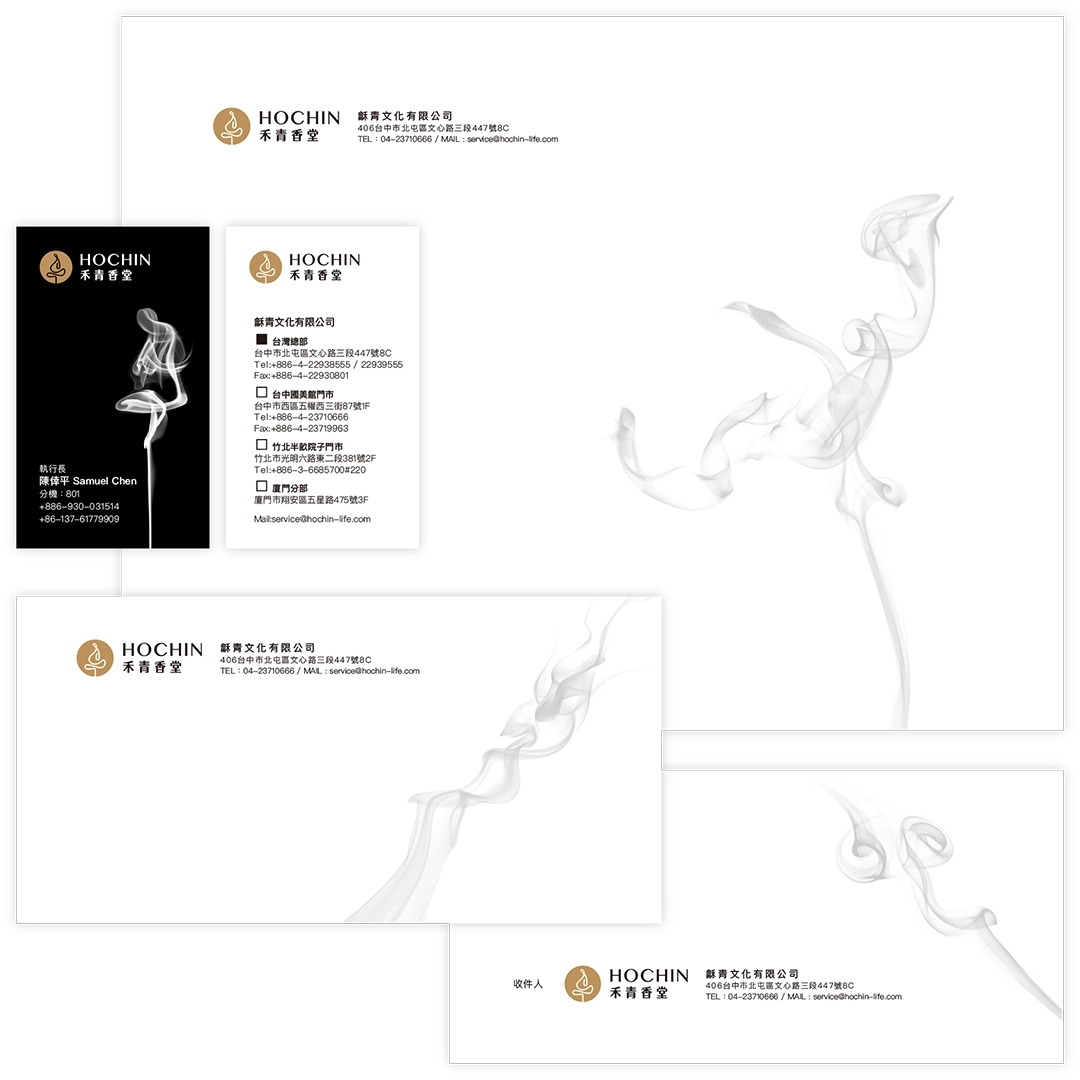
We applied the logo, standard colors, standard typography, and creative graphics to corporate stationery, including business cards, envelopes, posters, and more. Through the design of these items, we integrated the HOCHIN brand image into daily business activities, allowing the brand’s professionalism and unique charm to be showcased across various occasions.
POSTER DESIGN
PACKAGE DESIGN
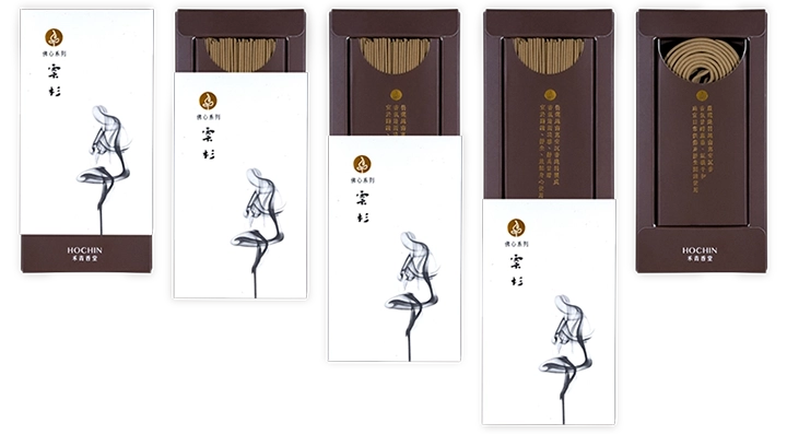
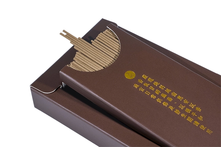
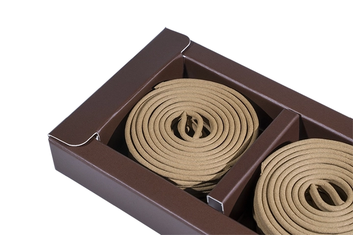
The main focus of this packaging design project is incense sticks and incense coils, which are fragile items and thus require special attention to cushioning and protection in the design. Additionally, the project involves more than 30 different product variations, divided into four tiers. As such, it was essential for us to consider cost-efficiency and inventory management for the client.
To address these challenges, we developed a unified packaging structure that can be shared across all product variations. We used hot stamping to effectively distinguish between different items. Our design process focused on maximizing the reuse of packaging materials, simplifying structural components, improving packing convenience, and minimizing storage space for unused packaging.
These were the key concerns we addressed throughout the packaging design process. Our goal was to deliver a practical and efficient packaging solution that ensures product safety during transport while also saving on cost and space. Combined with unique creative graphics, this solution aims to enhance HOCHIN’s professional brand image.
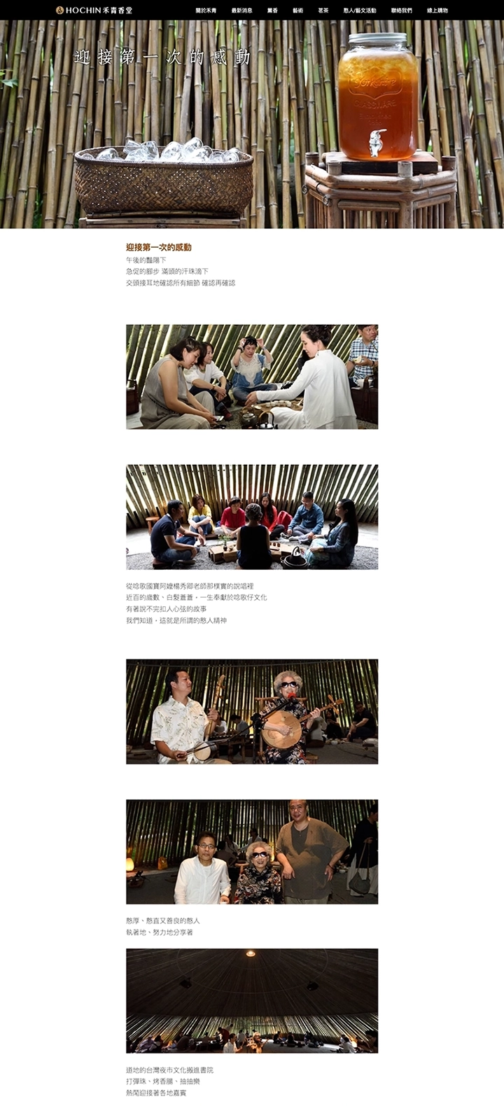
EVENT PHOTOGRAPHY
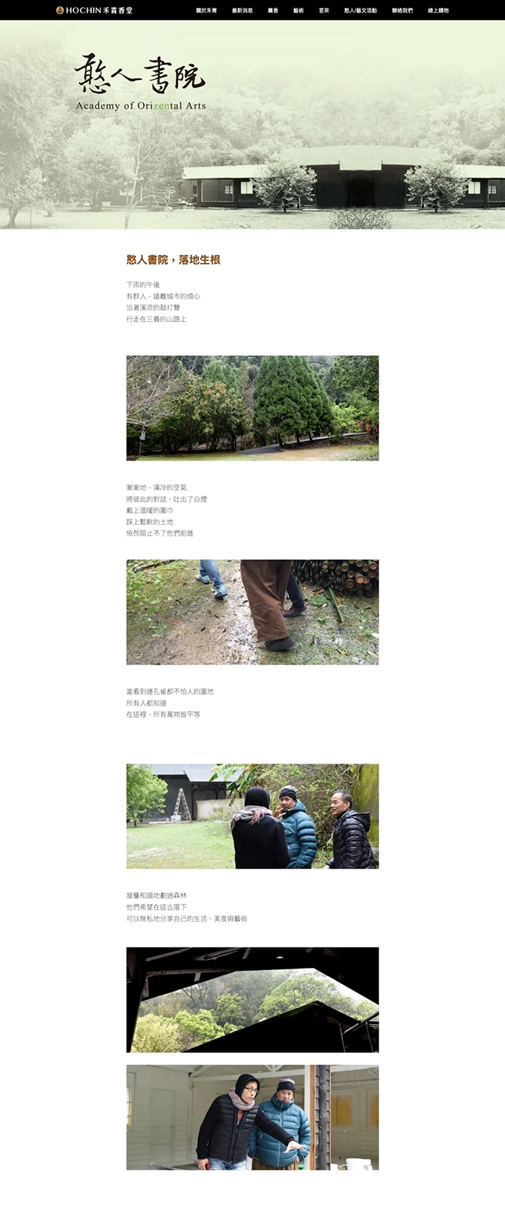
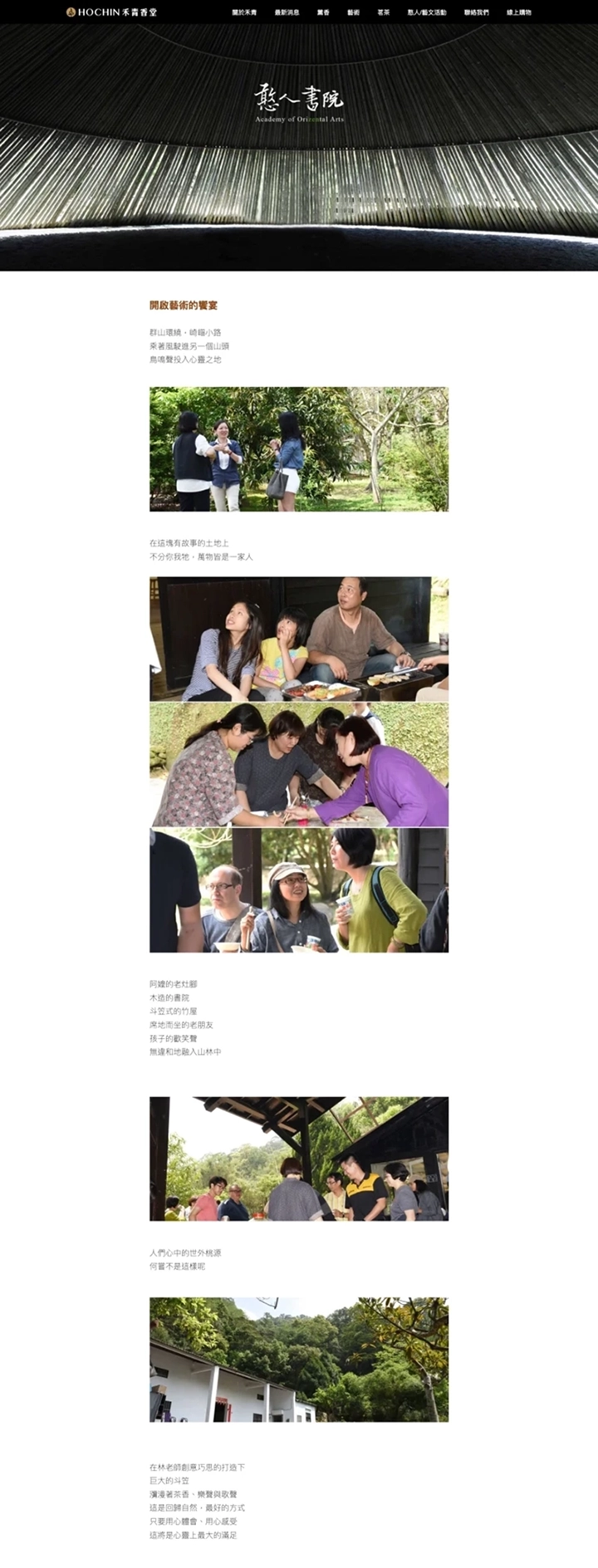
HOCHIN has long been dedicated to promoting the arts of incense appreciation and tea culture. In Sanyi, the brand established a cultural venue known as “Han Ren Academy”. The academy features a uniquely designed bamboo pavilion shaped like a conical hat, creating a serene and Zen-like atmosphere through its distinctive architecture and tranquil surroundings. Here, visitors can fully immerse themselves in the refined ambiance of incense appreciation, tea ceremonies, and traditional Chinese music, experiencing a deep sense of peace and harmony with nature.
The Han Ren Academy embodies HOCHIN’s unwavering commitment and passion for cultural arts. We hope this space becomes a gathering place for cultural enthusiasts from all walks of life, allowing more people to enjoy the spiritual nourishment offered by incense, tea, and artistic expression. Together, let us look forward to Han Ren Academy becoming a serene and beautiful retreat amidst the fast-paced modern world.
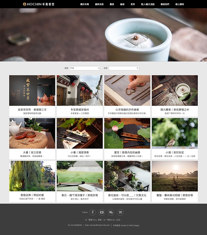
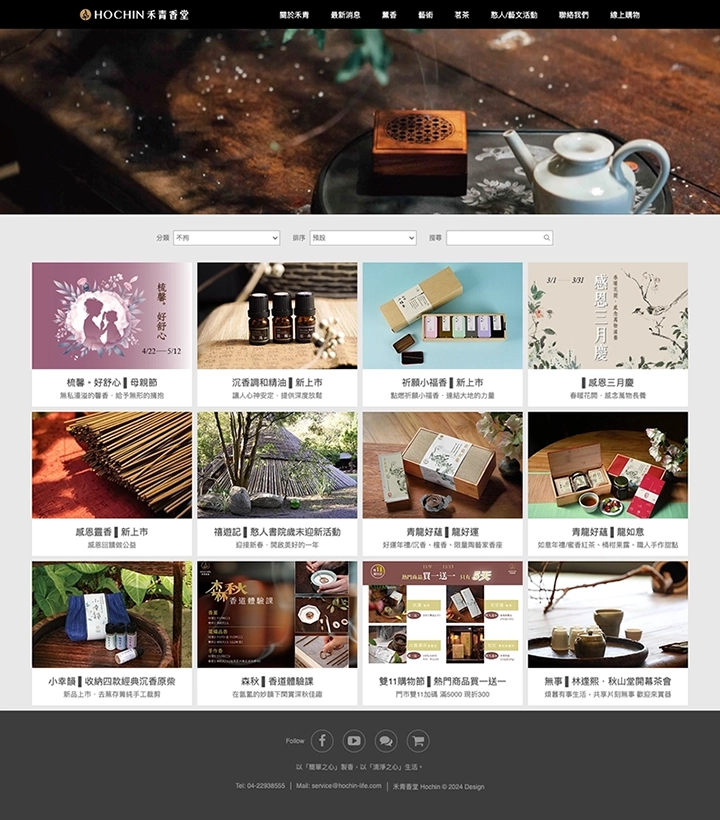
WEBSITE DESIGN
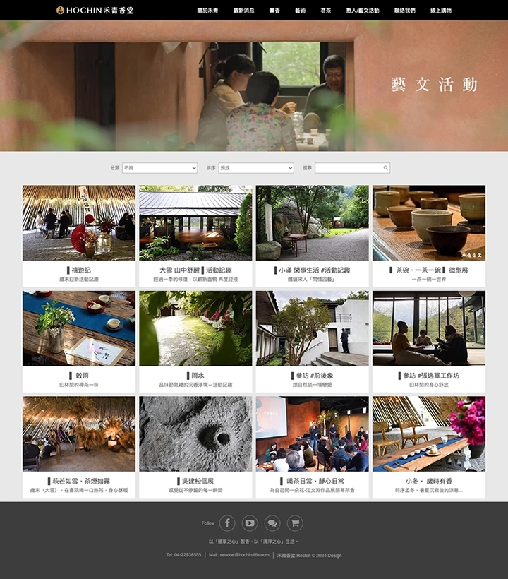
By incorporating photography, the logo, standard colors, standard typography, and creative graphics into the website design, we aim to provide users with an engaging and visually appealing web experience that showcases the brand’s cultural depth and identity.

