In brand identity, the design of the logo is crucial. It is not just a symbol of the company but also a tangible representation of the brand’s spirit and core values. Whenever consumers see a familiar logo, they instantly associate it with the brand’s culture, quality, and commitment. Therefore, the logo plays an irreplaceable role in shaping the brand image.
However, with changes in the market environment, shifts in consumer demand, and continuous technological advancements, many well-known brands choose to update and adjust their logos to maintain a sense of modernity and adaptability. This change is not just a visual innovation; it is a re-positioning of the brand’s identity and values in the context of different eras.
The evolution of a logo is often accompanied by strategic adjustments within the company. Whether it’s expanding market share, entering new markets, or strengthening brand youthfulness, the updating of the logo is often a key part of the brand’s evolution process. Through updated designs, a brand not only attracts new consumer groups but also reactivates the brand loyalty of existing customers.
To gain a deeper understanding of the significance of logo changes, we will examine the logo evolution of five widely recognized brands: Apple and Windows from the tech industry, Mercedes-Benz from the automotive industry, Gucci from the fashion industry, and Starbucks from the food industry. The logo evolution of these brands reflects the transformations within their respective industries and showcases how brands communicate their core values and future vision through visual language.

1. Apple: From Complexity to Simplicity in Technology
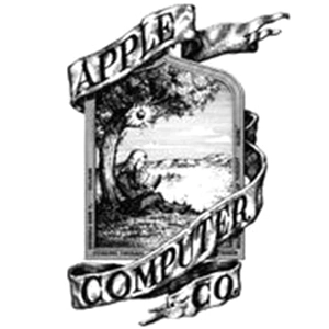
The evolution of Apple’s logo design is a textbook example of the simplification trend in tech branding. The first Apple logo, designed by Ronald Wayne, was a complex illustration depicting Isaac Newton sitting under an apple tree—symbolizing the source of wisdom. In 1977, Apple replaced it with the iconic rainbow-striped apple logo, representing the company’s innovation and diversity. By 1998, Apple abandoned the rainbow design in favor of a sleek, monochrome version, reflecting a more modern and stylish image. Today, Apple’s logo is predominantly minimalist and monochromatic, perfectly embodying the brand’s values of simplicity and efficiency.
2. Windows: From Classic to Modern Windows
The Windows logo has undergone several transformations over the years. In 1985, the original Windows logo featured a multicolored, three-dimensional window, symbolizing diversity and innovation. By 1992, with the release of Windows 3.1, the design became more flat and color-coordinated. In 2001, Windows XP introduced a logo with softer tones and rounded edges, giving it a friendlier appearance. In 2012, the launch of Windows 8 brought a complete redesign: the logo became a monochromatic rectangular window with clean, simplified lines, reflecting Microsoft’s shift toward modern, minimalist design principles.


3. Benz: The Fusion of Luxury and Technology
The Benz logo has also undergone multiple transformations since the brand’s inception. The earliest design featured gears and encircling letters, symbolizing the brand’s industrial roots. In 1909, the iconic three-pointed star logo made its debut, representing the company’s ambition to excel on land, sea, and air. Over time, the three-pointed star became a timeless symbol of Benz and was gradually simplified. Today, the Benz logo consists of a sleek three-pointed star enclosed in a circle, symbolizing the brand’s dominance in the luxury automotive sector. Its clean yet powerful design perfectly embodies Benz’s core values of elegance, innovation, and excellence.




4. Gucci: Iconic Transformations in the Fashion World
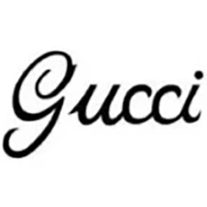
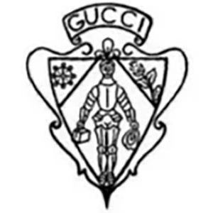
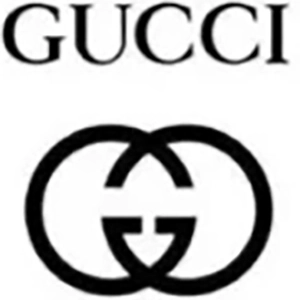
Gucci’s logo evolution reflects the brand’s status and influence in the fashion industry. The earliest Gucci logo was derived from the initials of the founder, Guccio Gucci, and featured a more vintage aesthetic. Later, the interlocking double G emblem became the brand’s iconic symbol, widely used across various product designs. In recent years, the Gucci logo has been further simplified, with the typography evolving into a more modern and elegant style. This transformation reflects the brand’s adaptation to global fashion trends and its strategy to appeal to a younger, more contemporary audience.

5. Starbucks: From Complexity to Cultural Simplicity
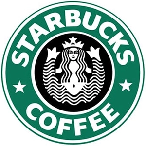
Since its founding in 1971, Starbucks’ logo has undergone several major transformations. The original logo featured a complex design of a twin-tailed siren, rich in detail, reflecting the brand’s respect for coffee culture and tradition. Over time, Starbucks gradually simplified its logo design. In 1987, the siren was modernized, with reduced surrounding text and details, shifting the focus to the image itself. In 2011, Starbucks implemented its most significant logo change by removing the encircling text entirely, leaving only the green siren symbol. This minimalist design emphasizes the brand’s global identity and cultural appeal.

Conclusion: Logo Simplification and Brand Evolution
The logo evolution of the five brands above clearly demonstrates that as brand identity develops, logo designs are increasingly trending toward simplicity and modernity. This shift is more than just a visual change—it reflects a broader process of brand reinvention and repositioning. A clean and straightforward logo is easier for consumers to remember and more adaptable across various media and applications, thereby enhancing brand recognition and market impact. Therefore, redesigning and simplifying a logo is a key strategy for brands to remain competitive in an ever-changing marketplace.